|
|
Post by Pavan on Jun 23, 2018 9:47:15 GMT
|
|
|
|
Post by therealcomicman117 on Jun 23, 2018 14:32:41 GMT
Keaton, with a close runner-up to the TDK design. I'll lol if anyone chooses bat-nipples.
|
|
|
|
Post by theycallmemrfish on Jun 23, 2018 15:29:07 GMT
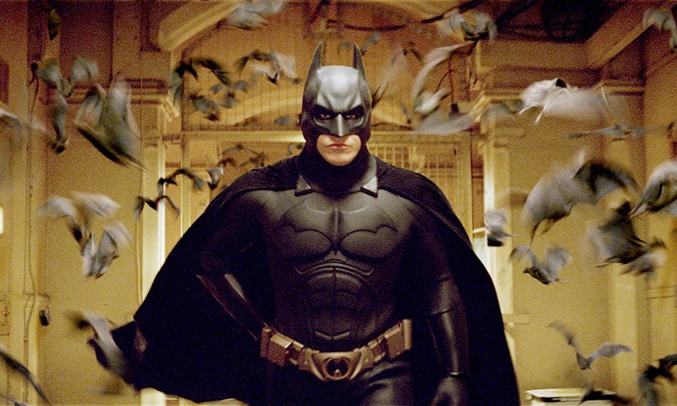
TDK. You don't really see it in the picture you posted, but it's sleeker than the others (remember when he wanted to be more mobile and not get bit by dogs?).
So that gets my vote.
|
|
|
|
Post by The_Cake_of_Roth on Jun 23, 2018 17:44:14 GMT
TDK gets it right. Ears not too long, head can actually turn, no nipples, simple bat logo, and I like how it looks like armor that can actually protect you without being bulky.
|
|
|
|
Post by Tommen_Saperstein on Jun 23, 2018 21:50:36 GMT
|
|
|
|
Post by countjohn on Jun 24, 2018 6:07:38 GMT
I guess Batman vs Superman, just because it has the best general template, solid grey suit, black cape/helmet. The fat batsign looks stupid, though.
|
|
|
|
Post by Johnny_Hellzapoppin on Jun 24, 2018 10:27:53 GMT
Batman Begins I suppose
I like the original Keaton ones too.
|
|
|
|
Post by stabcaesar on Jun 24, 2018 10:35:15 GMT
They all look absolutley hideous.
|
|
|
|
Post by Pavan on Jun 25, 2018 6:39:45 GMT
Batman Begins I suppose I like the original Keaton ones too. Begins is my fav too. |
|
cherry68
Based
 Man is unhappy because he doesn't know he's happy. It's only that.
Posts: 3,710 
Likes: 2,131
|
Post by cherry68 on Jun 25, 2018 11:33:49 GMT
|
|
|
|
Post by Martin Stett on Jun 25, 2018 12:42:55 GMT
|
|